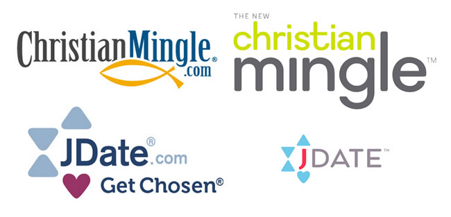
Spark Networks property JDate has completed a site revamp, with sister property Christian Mingle about to experience the same. With each redesign, new logos are in order. Here are how the logos have changed:

Yes, the new Christian Mingle logo is more than terrible. A low quality font choice, and I’d be curious to see if anyone picks at the lowercase “C”. On that note, with ‘Christian‘ taking up less real estate in the logo, does that mean it’s being distanced somewhat? What else does “the new” mean other than look/feel/feature upgrades? Why isn’t JDate also labeled with “the new”?
Looking for someone to enjoy the rest of my life who is a Christian.
Looking for a man to enjoy the rest of my life and yours as well.. A Christian man.