I proceeded through the eHarmony questionnaire the other day, which I was actually really impressed with. It’s no longer a long list of boring pull-downs, but instead a one-question-per-page-click-your-answer style. It’s visual, and seems shorter as well (20-30 minutes to take?). Also, you can quit at any time and continue on where you left off (not sure if the ‘old’ questionnaire let you do that).
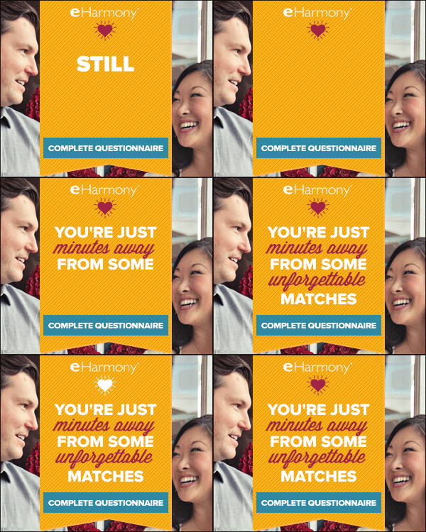
Regardless, what I wanted to talk about here was eHarmony’s retargeting efforts. Oddly, I did complete the questionnaire (and logged into my account multiple times) so this retargeting effort is a bit incorrect (i.e. “complete questionnaire” call to action).
Anyway, the current retargeting banners that I’ve been served are shown below:


Aside, I was always a fan of the “You’re just minutes away…” copy.